Overview
Victoria’s Secret wanted to improve the online checkout experience to reduce drop-off and increase order completion. I worked closely with Product and Engineering to identify key friction points, streamline the experience, and introduce transparency around delivery timelines. The result were multiple design enhancements leading to improved checkout conversion. I have been able to share only 2 of those here due to NDA restrictions.
My Role
- Conducted user research through interviews, data analytics and synthesized the insights through affinity mapping.
- Conducted workshops with PM and dev to prioritize identified opportunities.
- Collaborated with PM to finalise direct implementation enhancements and potential A/B test.
- Collaborated with legal team for identifying correct language and disclaimers.
- Created high fidelity designs and prototypes.
- Responsible for Dev handoff.
Duration
2 months
Team
1 Designer (Me)
Product Owner
2 developers
Tools
Figma
Adobe analytics
User Zoom go
+3%
conversions
+1M
annual revenue
The Challenge
- Increase speed and conversion in checkout.
- Analytics revealed users were dropping off at multiple stages of checkout—especially during delivery selection and order review.
Problem & Solutions
Problem #1
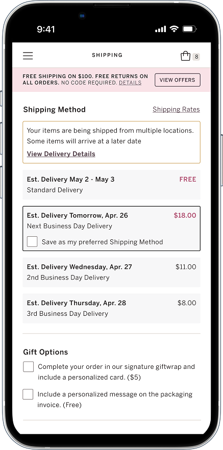
Provide transparency regarding late delivery dates in checkout & enable users to select faster shipping for eligible items
Current experience did not allow did not allow users to choose faster shipping for eligible items when mixed with standard-only products. As a result, delayed delivery dates were only revealed post-purchase via email—leading to frustration and a decline in trust.
Solution #Part 1
Display late delivery date in shopping cart

Solution #Part 2
Allow users to select faster shipping for eligible items in checkout
Solution #Part 3
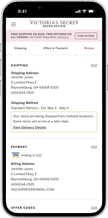
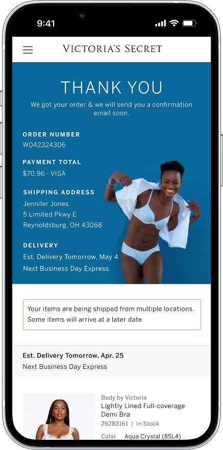
Consistant messaging regarding late delivery in order review and order confirmation page
Solution #Part 4
Aligned post-purchase emails with site experience
Problem #2
Enable instant order placement and maintain constant access to ‘Place Order’ button on order review page
As users scrolled though order details on order review screen they found it to difficult to locate the 'place order' button.
Solution #2
Sticky place order button
With the 'Place order' button being sticky, users were able to place their order as soon as they were ready to do so.
Displaying payment total along with the button was crucial because it is a key piece of information users review before clicking place order.
The button stays fixed at the bottom for easy access within the user’s thumb zone.
Learnings
1
Systems thinking is important to provide a cohesive experience across multiple touchpoints during and post purchase.
2
Involving dev team in design process through workshops can elevate their enthusiasm for the project, leading to smoother collaboration.